I made this for a user's contest on Fallen Sword who has the same general interests I do, so I knew what he would find appealing. Unfortunately, I made this, unaware of the fact that he was holding an avatar contest, not a signature contest. So currently I am auctioning this off and planning new ideas for his contest. He likes DBZ, Red Dead Redemption, ODST, and many other things.
Thursday, June 10, 2010
Halo 3: ODST
I made this for a user's contest on Fallen Sword who has the same general interests I do, so I knew what he would find appealing. Unfortunately, I made this, unaware of the fact that he was holding an avatar contest, not a signature contest. So currently I am auctioning this off and planning new ideas for his contest. He likes DBZ, Red Dead Redemption, ODST, and many other things.
Wednesday, May 26, 2010
My First Tutorial
I made this over the course of 3 days. It is a tutorial for the Charizard sprite piece below, or rather this image is just the proof that I made it, it's currently only on sale for Fallen Sword at the moment. But I'm sure it's only a matter of time before I release it for free. Or you could follow my blog and I'll send you a link for you to enjoy ;)
One major issue I had with making this tutorial is that I had saved about 2/3 of the way through, and when I had finished it was about 2 a.m. so when I was closing stuff out I accidentally shut it down without saving that last third of the tutorial. So in reality, it soaked up an extra day to complete.
--Fourbrezio
Monday, May 24, 2010
Charizard
This is the second installment of a project I am calling "The Big Three" which of course consist of the 3 original starter's final evolutions for the pokemon series; Charizard, Venusaur, and Blastoise. Since you've already seen Charizard and Venusaur, I'm sure you're at the edge of your seat with the final piece, Blasoise, yet to be released. So try your best to hack my PB account so you can see a preview.
This will be my absolute favorite piece of this project. The colors just feel perfect with this sprite. The text was originally just "Charizard" but when I sold it someone actually posted some Japanese for the undertext. I believe it's pronounced "Sei no Takusestu" or something along those lines. Haha I'm only in first year Japanese at my school I have a long way to go before I can read that.
Anyway, If you haven't guessed already I finished the Blastoise one as well. It's a bit more like the Venusaur piece but i attempted to recreate the same C4D effects that Charizard had. Without a doubt I failed miserably. I may end up just scraping and redoing the whole piece, I am just not satisfied with it yet.
--Fourbrezio
Wednesday, May 19, 2010
Imagine
Here's a signature I finished last night titled "Imagine". It's the first piece I've actually completed using a stock in about a year. The stock image was fairly overused, but I think I might have brought it to new "light" haha you see what I did there? Yeah I bet you did. I followed a tutorial out of a resource pack I found on my new favorite graphics forum, GFX Heaven. If you want to know more join, and have your work critiqued by some of the webs leading artists.
--Fourbrezio
Monday, May 17, 2010
Landing On Mars
--Fourbrezio
Friday, May 14, 2010
My European Friend
Anyway, although he cannot speak english too well he somehow figured out how to order an avi through me in english. Being rather impressed I mustered this little number up for him. Yes, I topazed the hell out of the Background, but thats because it was a picture of a crumbling blue wall. I think I altered that to suit my needs rather well if you ask me.
Fortunately, the client has a bit of a big mouth, no offense. Which means I should get a whole new set of clients to cater to.
--Fourbrezio
Thursday, May 13, 2010
Abstract Floater
--Fourbrezio
Tuesday, May 11, 2010
Vampirella
I'm definitely not a fan of my lightsource work on this piece, but I do love the focal and her pose. I think my biggest problem with using this style is that I cannot find any new C4Ds to work with. Although you may not notice it, I've used the same 2 or 3 C4Ds for all my new works.
--Fourbrezio
Wednesday, May 5, 2010
Kingdom Hearts
I think I am finally starting to figure this style out, although I wouldn't recommend remving the Black and White gradient map, the colors are shit. Even though they can easily be redone, I would still think the gradient map looks better.
Well a friend of mine that sits next to me in my first period just saw this and wants something of his own, so expect another post tomorrow.
As for the dreaded comfort zone, I think anytime you use a style where you cannot do everything with your eyes shut, you're stepping away from it. But in this case, I took a giant leap off a 20-story building to escape my CZ. Well, stay tuned for tomorrow when I reveal Zach's new banner
--Fourbrezio
Tuesday, May 4, 2010
Venusaur
Up until the very end of creating it I had him just sitting on a mound of solid green, which made it look very plain. I thought some grass was in order, he is after all a grass type pokemon. So I went back through all my layers and made necessary corrections so that grass would show up easily without having to do tons of recoloring or gradient mapping. The grass was unexpectingly, the most difficult part of the tag, probably due to the fact it was added in the end. The toughest part of the grass addition was trying to match it with the lighting and making it fade out seamlessly so that it won't distract the viewer.
I went out of my comfort zone a few times during the course of this creation, mostly because I was using photomanipulation skills in a sprite signature, which is very uncommon. Also, when it came to placing the C4Ds around Venusaur's flower, I was at a loss when I started with it, and had to experiment 3 or 4 times before I got the desired effect. It just goes to show it pays to have patience and experiment.
--Fourbrezio
Friday, April 30, 2010
Dead Space
I made this for this weeks NSOTW (Newbie Signature of the Week) on Planetrenders which had "Horror" as it's theme. I was really struggling to find a subject and style to work with. I knew that Planetrenders had it's fair share of skilled artists, with talents ranging from photomanipulation to abstract work. I can only hope that the moderator in charge of the contest disqualifies the better work by deeming it "Un-horrifying". I am the mod for this weeks SOTW on Fallen Sword Forums since it's usual leader, DavidJames, is MIA at the moment. (Supposedly getting hitched, good luck to ya!). No offense or anything, but I hope he retires. His duties on FS are being shirked and the members need someone that is more active. But then again, the forum itself is somewhat of a joke to be honest. They're stuck in one place like a 1960's black and white town in the middle of modern america. I don't want to sound like a Hitler or anything, but they need to expand. If I was a permanent moderator I could bring them out of their stall, both in members for the game, and their inability to manage an effective game forum.
...Sorry about that rant, but they all make my OCD itch kick in.
Anyways, In the SOTW im moderating, we are also working with the Horror theme. And now I realize why I've only recieved one entry so far. No matter how easy this seems, this theme is ridiculously difficult! Now with my entry into PR's forums, I did a photomanipulation. I used a screenshot of the door with the light and such, but I added in the character and corrected the lighting before working on depth and the aesthetics of the piece. But honestly, you could probably tell that without my commentary, it's definitely not the best piece I've ever done. If you stumble across the contest, be sure to place a vote for yours truly ;)
--Fourbrezio
Thursday, April 29, 2010
Hitman
I found this while cleaning out my photobucket. I think it was my very first photomanipulation signature. Now that I think about it, I entered this in an amateur SOTW (Signature of the Week) that wasn't exactly amateur... all the artists produced works ten times better than this. Which really irritated me, I took the 2 hours to make this glorious Hitman tribute, and it was futile, I maybe got two votes out of the usual 40 that cast their ballots in this contest. I think the individual pieces of this tag were just meant to go together. I found a stock of an abandoned tunnel in Germany, and with my Hitman render already picked out I found a few C4Ds to help me compose my idea.
Perhaps while on my break I should follow my own advice and draw a few ideas for signatures since i usually throw mine together in experiments.
--Fourbrezio
Breathe and Break
This was the first time in about a year that I used a tutorial for a signature. At first I skimmed it to get a few ideas for what I wanted to do, but ultimately, I couldn't produce something by combing my own style with this creator's ideas so I just followed the tutorial step by step. Some of the critique I recieved on it was a little discouraging, I thought it was a fairly decent outcome, but others responded to it with comments like "I don't know what it is, but this piece is jsut not catching my eye, no depth maybe?" NO DEPTH?! I assumed I knew what depth was but I guess I was mistaken. Last night, in my haste to redeem myself, I exhausted my fire for graphic design and decided I should take a short break. I will post some of my recent pieces, but nothing brand new. I need to take this time to reevaluate my career and how I can improve with my works.
--Fourbrezio
Wednesday, April 28, 2010
New Style Avatars
This was not made with a tutorial however. I tried to reenact the feeling of beingSam Fischer from Splinter Cell: Conviction. That he has to be absolutely stealth at all times. The render's expression was perfect for this piece. Someone named robotussin was holding a contest out of the graphics section in the FS Forum. He's from For Frack's Sake, but no one seems to mind him. His only stipulation for avatars was that he didn't want anime, which is what I specialize in. So I definetly stepped out of my comfort zone with this one.
--Fourbrezio
Tuesday, April 27, 2010
Are You DAFT Man?
I started trying to brush up on one of my old styles, just to see how well I could produce something of significant substance to my taste. This was my first outcome. The goal of this style is to effectively place a render into a stock and blend it in to make it look like its supposed to belong there. This is a form of photomanipulation but with a signature. LP's are easy enough to do with this style, but difficulty skyrockets when the canvas is 1/4 it's original size. Details become so important you'd wish you had OCD.
The main goal of such a photomanipulation is to make the piece look like a stock signature rather than one with a render. I think I conquered that with this piece quite nicely. It is very difficult to tell but I actually used a fairly mainstream Photoshop plugin known as Topaz. "Someone" erm... named "Google" gave me a link to thepiratebay.org and to a free set of plugins from TopazLabs™. It was only used to clean up the noise from the background stock but it helped tremendously. I highly recommend that plugin to anyone owning any image altering adobe product, just don't overdo the effects.
--Fourbrezio
Monday, April 26, 2010
Pounce On it
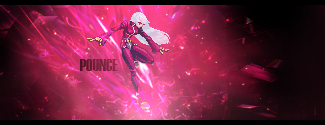
This was part 2 of 3 in my sprite projects folder. There is not much to say about sprites that I haven't already posted. Just remember: flow is key, and ligthing will help you achieve that while accomplishing a creative depth.
To be honest, I think creating this piece brought me out of my anti-constructive binge that I was experiencing. I had not created anything decent in almost a year, and the pressure to come up with something to continue my graphic design career was daunting. Believe it or not, this piece might have saved my life... I started going to Marine Corps PT (Physical Training) Sessions to try to fill my time and find a career for me. I think I'd much prefer to sit on my lazy butt all day and fry my brain with photoshop.
This piece's depth gets deeper and deeper the longer you look at it, and I love that about the C4D's I used. I knew exactly what I wanted to accomplish with this piece and I believe now I have enough knowledge of Adobe Photoshop CS4 to know how someone else does a signature or tag. To simplify, I can visualize someone elses piece, and create my own tutorial for it in my head.
--Fourbrezio
Tuesday, April 20, 2010
Ace Combat 6: Fires of Liberation
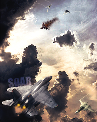 This was once one of my favorite live action Large Pieces. I had to use a total of 5 renders, all of which I had to alter the lighting and depth and such. All together this took me maybe 13 hours to complete. And yet I don't think it had quite enough work done to it. The background image wasn't edited at all give or take a few gradient maps. I think I brought the subjects (planes) to the scene, but not the scene to the subjects, if that makes any sense. I still have the .psd, perhaps I could redo some parts and sell it for a pretty penny huh?
Since I do not have many followers yet, I would not request CnC (Comments and Criticism) but if you happen to read this, it would be very much appreciated.
--Fourbrezio
Wednesday, April 14, 2010
Dusknoir Sprite Signature
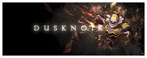
This was just one of a three-part project I was doing to earn a little bit of walkin around money. Sprite tags names are usually indicative of the focal or subject of the signature. In this case we used a Pokemon Platinum game sprite of the evolution of Dusklops, better known as Dusknoir. Obviously, this is a very action oriented sprite, as well as a powerful ghost type pokemon. In order to appeal to all players and devoted fans of the Pokemon franchise, I needed to make this "leap" off the canvas in a spooky or ghostly fashion. Not to brag, but I believe I captured this Pokemon as well as the idea in a harmonious piece.
The best advice anyone could give about sprite tags is that you need to experiment, then practice the experiment that gave you the best results over and over again until you define a style for yourself.
Personally, I found that I LOVE smudging. It creates depth, flow, and if practiced enough, can create very realistic lighting with the assistance of other brushes.
--Fourbrezio
Monday, April 12, 2010
Avatars for FallenSword
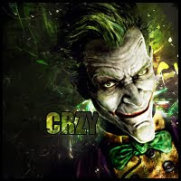 This is just one of about ten 200x200 pixel avatars that I've done for the various players of the MMORPG called FallenSword. Due to most of my time on there being devoted to the forums and whatnot, I usually ignore the concept of the game even though I am contracted and paid in game currency. The forums there are actually where I got started about 3 years ago, and after an extended leave, I have returned to see what my instructors and senseis have all been up to. To be honest, art in general has been somewhat "sucked dry" from that corner of the net, although a few special artists contradict that statement. But, in order to maintain order, all "avatar shops" as they are frequently called, follow a set amount of rules that must be adhered to... As well as an outline for the orders people place:
- "Give me a render/Stock/Theme:"
- "What text do you want?:"
- "Anything Else?:"
As you can probably imagine, this could get rather monotonous and quickly desensitize you to the thrill of graphic design, as it did for me some time ago. But now I'm back :D
With regards to the piece in this post, yes, the render was provided. You can find this one and tons like it at Planetrenders.com. And as for self Comments and Criticism (CnC), I love the way it turned out... just not the circumstances in which it was created. End of Story.
--Fourbrezio
Thursday, April 8, 2010
My Work Says it All...
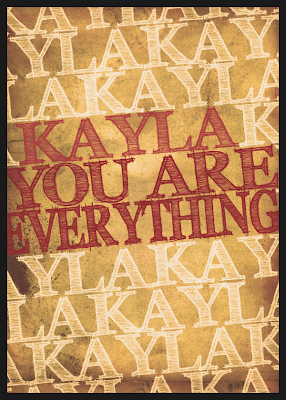 This was the final piece of the two part gift set to my girlfriend. As you can see, it expresses my feelings in a more explicit way than the other one did, as was my intention.
It is entitled "Parchment Truth", and is the first text based LP (Large Piece) that I have ever done. I got the idea when I was looking through a list of the top posters of 2009. Someone had a piece with a similar composition so credit goes to him or her, whoever you may be, thank you for inspiring me.
As for comfort zone level, I didn't stray too far from normalcy since this was somewhat of a recreation, and not my own idea.
The best advice I could possibly give for someone who wanted to try their hand at a "poster" type based LP, it would be that you need more inspiration for something like this than for anything else. The text needs to pertain directly to what you're being inspired to, and your focal needs to somewhow tie the text to the theme while maintaining flow (and depth if necessary).
--Fourbrezio
If you desire anything I used please message me with your e-mail and you'll have it shortly.